[EN] Mobile newsletter templates
Mobile optimisation of your newsletter templates
The mobile-optimised newsletter templates expand the possibilities of conventional templates in the eworx Marketing Suite in that they are optimally displayed on mobile devices. A technology called "media queries" – also known as "responsive web design" – is used to display the newsletter perfectly on smartphones. The mobile newsletter templates are optimised for the smaller width (based on the resolution) of smartphone screens. The layout of the content is also optimised to ensure optimal readability.
Important links are also adjusted for display on mobile devices, as the lower resolution of the screens can make it difficult to click on links that are too small. In general, the mobile-optimised template cannot be filled with content other than that available in your "normal" campaign.
Mobile newsletter templates – Supported devices
The following applications support the technology required to optimise newsletters for mobile devices:
- iOS standard App from Apple iPhone 7
- Android 4.2 or higher standard App
With the Android operating system, whether the technology for mobile-optimised newsletters is supported depends on the respective device, the app used or the manufacturer. This technology is only partially supported on Android if the newsletters are consumed via Samsung Mail or Microsoft Exchange.
All other operating systems and devices only partially support this technology.
If you have any questions, please contact our service team.
The big advantage of mobile newsletter templates
More and more subscribers are opening their emails on mobile devices such as smartphones – the trend is clearly moving in this direction. Since these devices have a smaller screen size (approx. 5.8 to 6.2 inches) than large monitors, newsletters must be optimised for this smaller size.
As a survey on the email clients used shows, the use of mobile devices is steadily increasing. You can therefore significantly increase the chances of success of your mailing with mobile-optimised newsletters.
The layout of mobile-optimised newsletter templates
Basically, the layout of a newsletter must be optimised for mobile display so that the text is more readable and more appealing on smaller screens.
The layout of the responsive newsletter is not optimised for a fixed screen size, as there are countless different resolutions and screen sizes. To be best equipped for all sizes, it is advisable to create a "fluid layout".
A fluid layout means that the size of the newsletter elements (sections, texts, buttons, etc.) is based on the maximum size of the screens – the elements are scaled to the maximum width of the smaller screen.
The appearance of the "original" newsletter must be simple and clearly structured, as complex newsletters cannot be optimised for mobile devices.
Images
The appearance of an image (or section, etc.) is not changed during mobile optimisation – an image is displayed in a smaller size. Smaller images from the ‘normal’ newsletter, on the other hand, are not enlarged, as this process causes blurring in the image.
This example shows how the image is reduced in size.
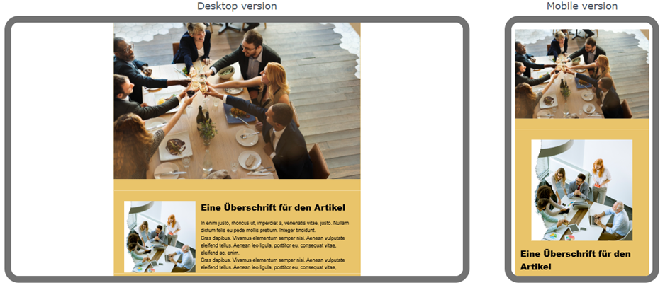
This example shows how the image is not reduced in size if there is sufficient space.
Clickable areas
Clickable areas for the subscriber – such as links and images – should have a minimum size of 44 x 44 pixels in mobile-optimised newsletters so that they can be easily touched with your fingers on touch displays.

This example shows several links in a ‘normal’ newsletter, optimally aligned for use with a mouse. However, when viewing on mobile devices, it is possible to accidentally click on the wrong link.

In this example, the links are now optimised for mobile use. The blue area marks the entire area that can be clicked on with your finger.
For mobile-optimised newsletters in the eworx Marketing Suite, a mixture of both variants is used. Depending on whether the newsletter is opened in ‘normal’ email programmes or on mobile devices, the viewer is shown variant 1 or variant 2.
TIP
In this context, it is also important that the content or pages behind a link are also optimised for mobile devices. For example, if you link to a form in the eworx Marketing Suite, it is automatically optimised for mobile devices.
The structure of mobile newsletters
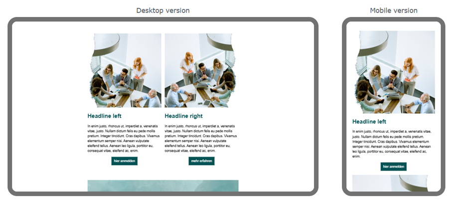
On mobile devices, newsletters are displayed in a single column for optimal clarity. If a "normal" newsletter has two or more columns, it must be reduced to a single column in the mobile version.
The existing structure of the newsletter is used for this purpose. The order of the elements or newsletter sections can only be changed in a certain way for a mobile version.
In sections with an image and text field, the image is displayed first, followed by the text.
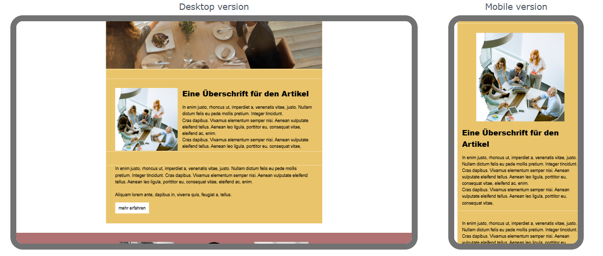
Columns that are next to each other are displayed one below the other in the responsive view.
The example above best illustrates how the basic structure of a newsletter changes during mobile optimisation and how images and text are rearranged.
Updated 8 months ago