
[EN] Create a design
Create your own custom template
Our experts would be happy to take care of designing your bespoke email template. Together, we’ll develop a custom template in line with your company’s corporate identity that perfectly meets all your requirements.
If you’d like to create the design yourself, this step-by-step guide provides all the key information you need to ensure your wishes and requirements are implemented as effectively as possible in the new template.
The right format
It is important that the design is supplied in a format from which we can extract the font sizes, colour values and image dimensions.
Please always use pixel values for image and font sizes!
Create your design in one of the following formats:
- Figma
- Adobe InDesign
- Adobe Photoshop
- Adobe XD
- HTML (all text must be included in the file!)
The following formats are not suitable:
- Canva
- Adobe Illustrator
Step by step to your dream design
1. Set the width and spacing
Our recommendations are:
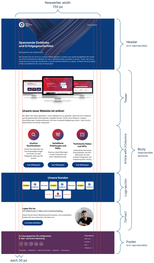
- Newsletter width: 600px – 780px (desktop) and 385px – 415px (mobile)
- Additional spacing from the content: 20px – 40px (desktop) and 10px (mobile)
2. Include a font
In emails, you should use web-safe fonts (e.g. Arial, Verdana, Georgia, …) as these are installed by default on most devices. If you wish to use a so-called web font, we recommend using Google Fonts.
Any other custom fonts used in your company’s corporate identity (CD) can also be incorporated into our templates. Please provide us with the relevant files!
For email clients that do not have the custom font installed, or which do not support web fonts or custom fonts in general, we will specify an alternative, web-safe font as a fallback font.
3. Defining font sizes
We recommend the following font sizes (these comply with current accessibility guidelines):
- Headings: from 16px
- Body text: 14-16px
- Lead out: 12px and above
To ensure all text is clearly legible, font sizes below 12px should be avoided. Small font sizes may be interpreted as negative signals by spam filters – increasing the risk that your email will end up in the recipient’s spam folder.
The recommended line height for body text is 1.5 times the selected font size.
4. Creating a sample newsletter
Based on your previous campaigns, consider what requirements and preferences you have for the new template.
Our tip: During the design process, work with images and text from actual mailings to avoid any nasty surprises in the finished newsletter template.
The following points should be borne in mind when creating the newsletter design:
- Align text, images and other elements along common alignment lines. The programmes mentioned above provide "guides" for this purpose.
- The basic structure comprising header, body and footer must be observed. All campaigns start with the non-repeatable header and end with the footer. The repeatable sections are located in the body in between. Here you will find practical examples.
- Ensure a clear structure with sufficient spacing between sections and elements.
- Call-to-action elements must be large enough to be noticed and clicked on by readers. We therefore recommend buttons with a total height of around 50px. The width should be based on the length of the text.
Avoid:
- complex layouts with a highly nested structure
- too many columns for important information
- custom layouts or special solutions for individual mailings
- designs that rely solely on images
Responsive design
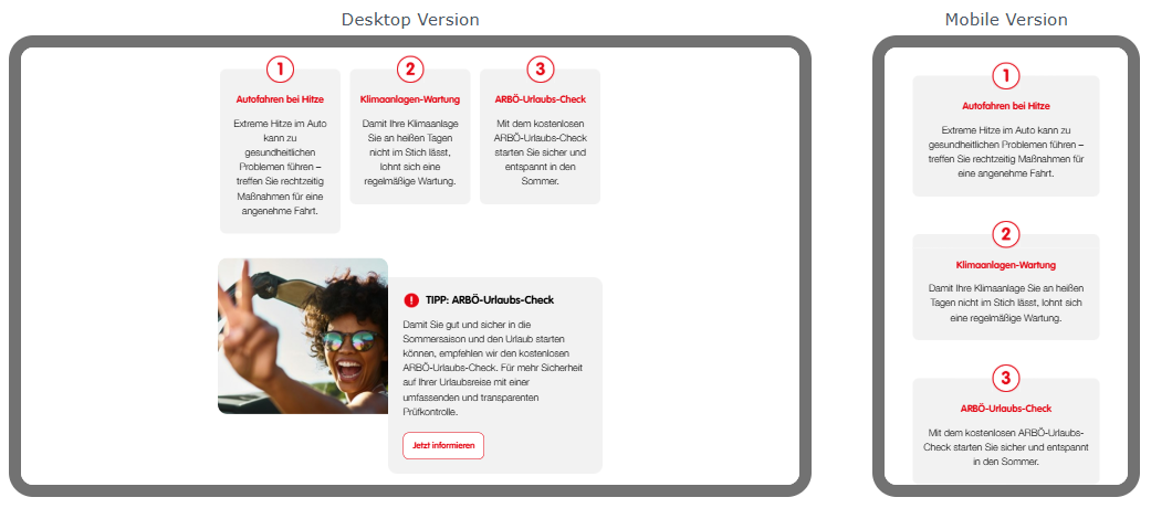
More and more recipients are opening their emails on mobile devices such as smartphones. As these devices have a smaller screen size (approx. 6.7 inches), campaigns must be adapted accordingly.
Whether your template is optimised for mobile devices therefore has a significant impact on the chances of success for your mailings. To find out which email clients your campaigns are being opened in, take a look at your newsletter statistics.
In desktop clients, multi-column elements can be displayed side by side very effectively. In the mobile version, however, the individual columns must be placed one below the other due to the narrower screen width. It is therefore essential to ensure that content remains comprehensible when viewed individually and is entered in the correct order.
You can find all further information on the mobile display of campaigns in this white paper.
Challenges in Dark Mode
Dark Mode can be enabled on any device. This causes the colours in your emails to be partially or completely inverted. Light backgrounds become dark, and dark text is displayed in a light font colour.
As each email client uses its own methods for colour adjustment, there is currently no uniform standard for Dark Mode. Modern email clients such as Apple Mail or Outlook Web can be almost entirely customised using rules in the template code. Gmail and Outlook Desktop, on the other hand, apply their own colour inversion algorithms and largely ignore any specifications. A completely consistent display across all email clients is currently not technically possible.
The following challenges occur particularly frequently in Dark Mode:
- Challenge: A logo with a transparent background disappears in Dark Mode.
Solution: Prepare the image file so that there is a light shadow around the dark area. In Light Mode, this shadow is not visible; in Dark Mode, it ensures that the dark elements of the image stand out against the dark background. - Challenge: The text is illegible in Dark Mode.
Solution: Our template experts will endeavour to retain your corporate identity colours as closely as possible in Dark Mode, or will look for suitable alternative shades.
Reality Check
Every email client uses its own rendering engine and interprets HTML and CSS differently. As a result, depending on the programme – particularly in Outlook and Gmail – a newsletter may differ slightly in appearance from the original design.
Our aim is to reproduce your newsletter design as faithfully as possible. However, due to the varying technical capabilities of individual email clients, we cannot guarantee that the design will be displayed exactly the same in every programme. Minor variations in spacing, fonts or the positioning of individual elements are technically unavoidable and cannot be completely prevented. What matters most is that your newsletter remains functional, easy to read and true to the character of your corporate design across all supported email clients.
Our template experts can tell you exactly which email clients are affected.
Get in touch now!
Frequently asked questions
Can I integrate videos into campaigns?
Yes, we can enable the video function for individual image placeholders. You can find further information on the video function in this white paper.
Is it possible to include background images?
Yes, background images can be included in the newsletter. However, it is important to note that very high-quality images and too many background images throughout the newsletter can result in long loading times for the recipient.
There are several ways to display a background image in the mobile version. You can find more information on this here.
Can CSS be used in campaigns?
Yes, this works without any problems in the web version. However, many email clients only support a limited range of CSS properties. The following properties are affected:
- Rounded corners
- Shadows
- Hover effects
- Animations
- Transparency
Transparent areas are displayed as solid colours in all versions of Outlook up to Office 365 and GMX/Web.de.
Is there a way to integrate JavaScript into the newsletter?
No, unfortunately this is not possible. JavaScript is blocked by most email clients for security reasons.
Our tip: Use animated GIFs instead of JavaScript animations.
Updated 2 months ago