[EN] Flexivorlage 2.0
Newsletter creation with the Flexivorlage 2.0
The Flexivorlage 2.0 supports you with flexible setting options for your campaigns. Use the flexible newsletter template to design your own personalised and individual email campaign. The ready-made template is extremely customisable and ready for immediate use.
You can find instructions for the entire newsletter creation process in the following whitepaper. This whitepaper also explains how to insert shared content, create links, insert images and videos and how sections can be restricted to subscriber groups.
What adjustments can be made in the Flexi template 2.0 settings?
To the right of the editing area is the ‘Settings’ tab. Here you have the option of configuring ‘fixed’ sections of the email campaign (e.g. buttons, introduction, leadout).
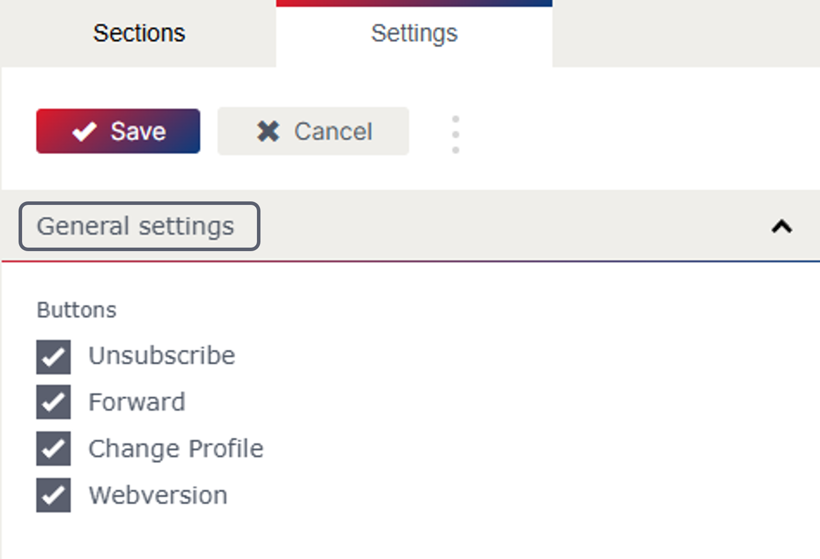
General settings
In the ‘General settings’ you have the option of showing and hiding the ‘Unsubscribe’, “Forward”, ‘Change Profile and ‘Webversion’ buttons. The buttons are shown by default.
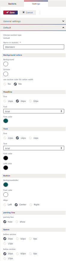
Default
Background colours
In the Flexivorlage 2.0, you can define the desired colour for the background and the background colour for the sections.
Headline
The font size, a web-safe font and the font colour of the headline can also be defined in the settings.
Body text
You can also define the desired font size, a web-safe font and the font colour for the text and for the links.
Button
In the settings, you can define the background and font colour of the button. You can also choose between left, centred and right for the alignment of the button.
parting line
You can set whether a parting line should be shown. If you have set that the parting line should be shown, you can specify the colour of the parting line and the line thickness.
Space
You can also set a space after the section in the settings. You can choose between 15px, 30px and 60px.
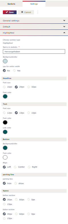
Highlighted
For individual sections, you can choose between Default, Highlighted and Custom for the "Layout". The settings for the "Layout" Default and Highlighted can be defined in the general settings
Background colour
As with the default layout, the background colour can also be set for the highlighted layout. You can also set whether the background colour should cover the entire width.
All other settings
can be stored in the same way as for the "Layout" default.
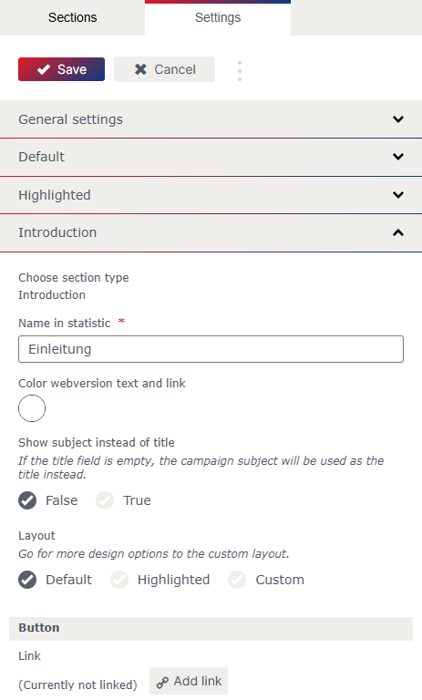
Introduction
In the “Layout” settings for the introduction, you can choose between Default, Highlighted and Custom.
If the "Layout" Custom is selected, the settings can be defined manually. If the “Layout” Default or Highlighted is selected, the values defined in the settings are adopted.
The link for the button can also be defined in the introduction settings. Buttons are generally only shown if they are linked and a text for the button has been stored in the settings.
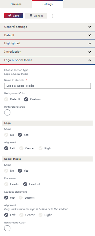
Logo & social media
The default background colour (which is stored in the default settings) or a custom background colour can be selected for the logo and social media area.
Logo
In the settings, you can specify whether the logo area should be shown. If the logo is selected to be shown in the settings, you can choose between left, centred and right alignment. The logo is shown above the header and the introduction.
Social media
You can also set whether image fields for social media icons should be shown. You can choose between Leadin and Leadout for the placement, and when selecting the placement in the Leadout, you can also choose whether the image fields should be shown at the top or at the bottom of the Leadout.
As with the image field of the logo, the alignment of the image fields for the social media icons can be selected between left, centred and right.
It is also possible to specify a desired background colour here.
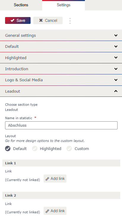
Leadout
As with all other sections, the layout can be selected in the Leadout. There is also the option of adding two more links.
What sections are there and what special features do they have?
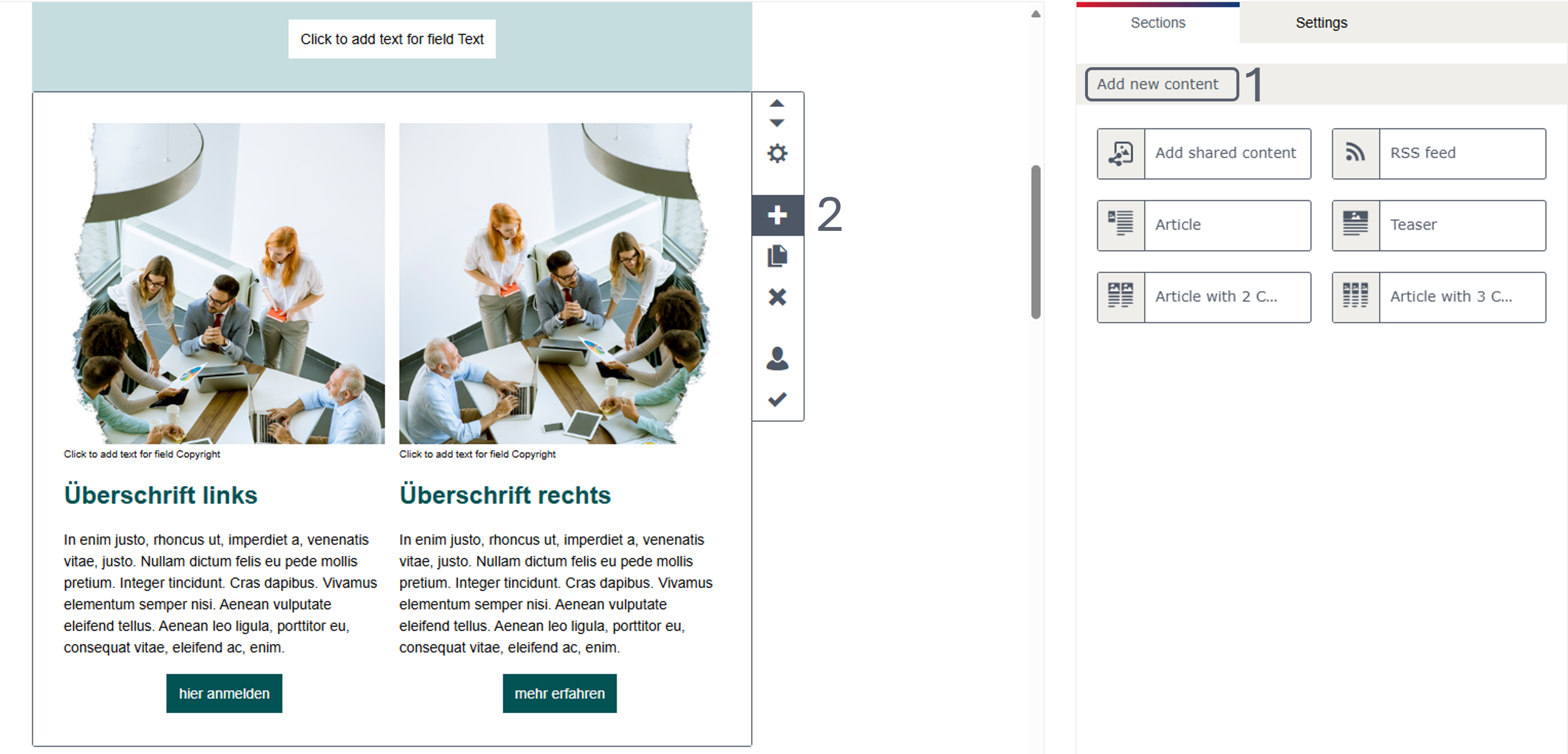
The following sections are available in the Flexivorlage 2.0 for adding further content:
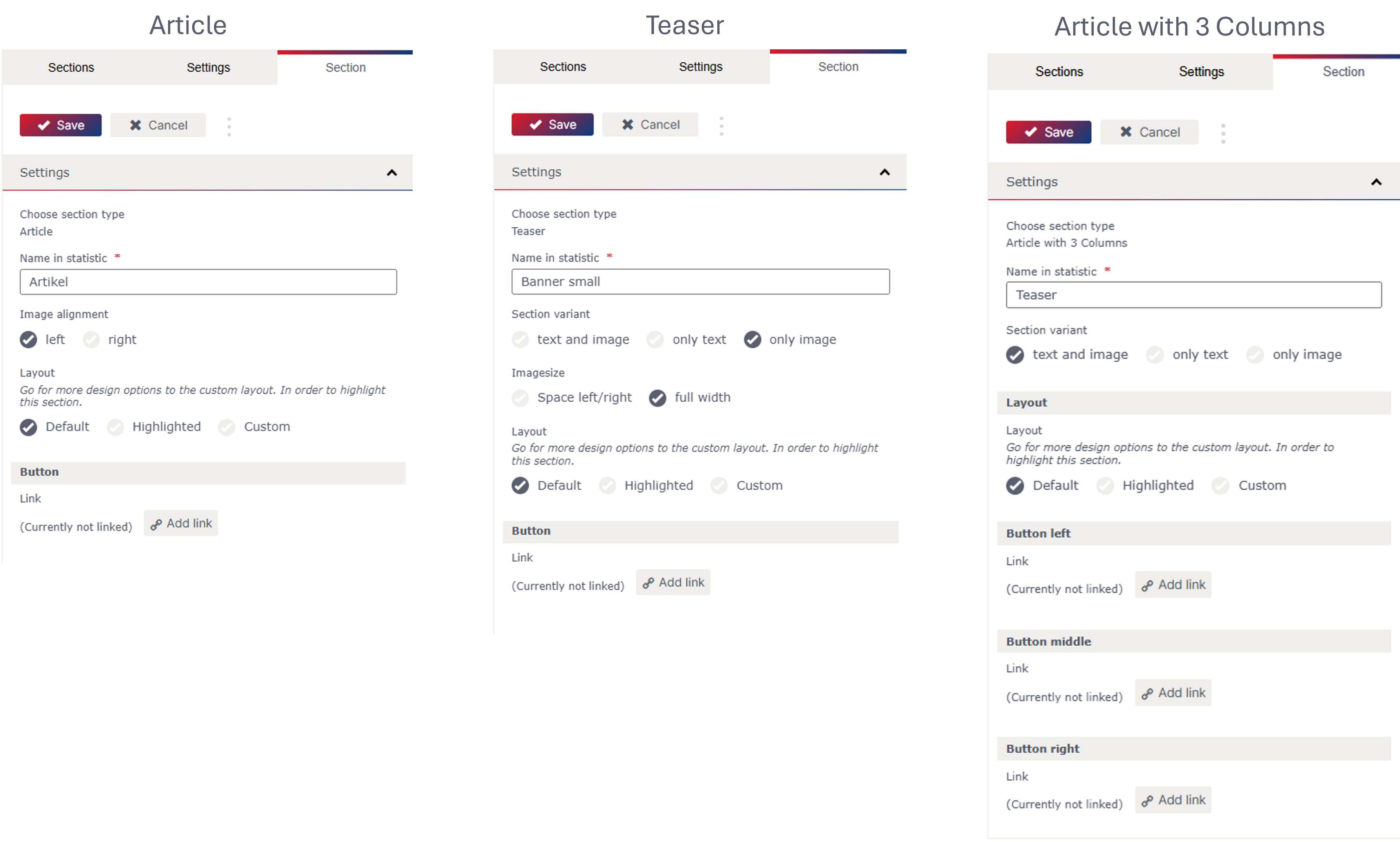
Article
Teaser
Article with 3 Columns
Article with 2 Columns
Each type has a different predefined appearance (e.g. single or multi-column, buttons, etc.) and contains image and text fields.
The sections are shown on the right in the “Sections” tab (1 in picture.) and can be inserted at the end of the email campaign with a click or by drag & drop to the desired position. To insert a new section directly below another one, use the “+”icon in the editing bar to the right of the section (2 in picture.).
What settings can be made in the individual sections?
The menu bar to the right of the section contains important commands such as “Add”, “Move”, “Copy” and “Delete”. It is also possible to limit the visibility of the section for a specific subscriber group (dynamic content).
The cogwheel icon takes you to the section settings, which can vary depending on the section type. In addition to the text box for the name in statistic of the section, you will find various setting options.
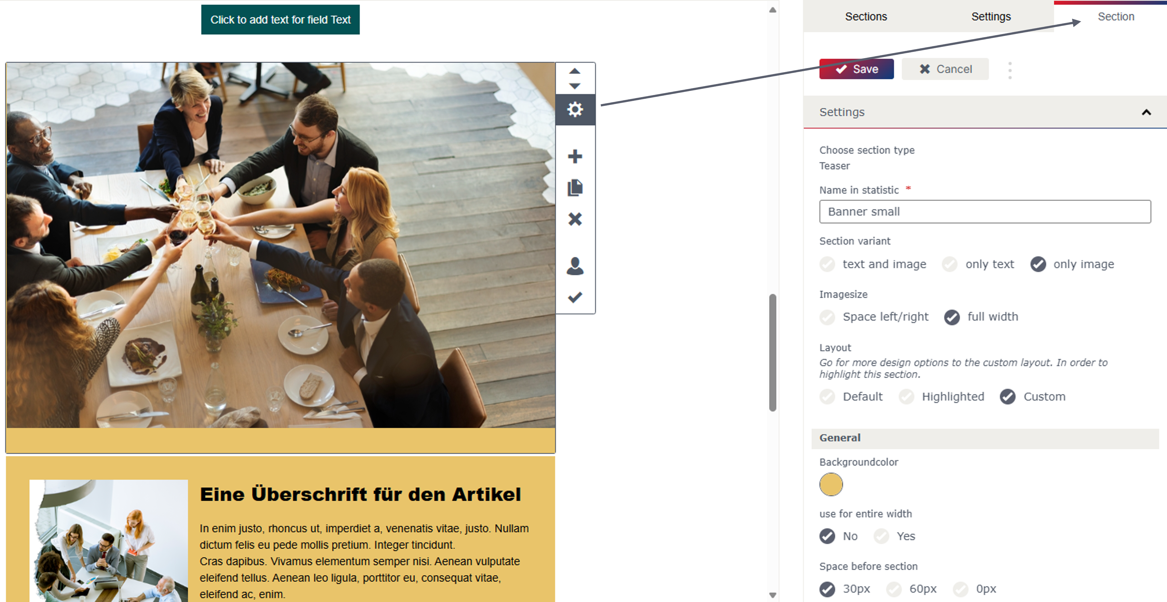
The “Layout” can be selected in the section properties for all section types. You can choose between Default, Highlighted and Custom. The settings for the “Layout” Default and Highlighted can be defined in the general settings.
It is also possible to define the links for the buttons in the section properties for all sections. For multi-column sections (Article with 2 and 3 Columns), a button can be defined for each column.
Buttons are generally only shown if they are linked and a text has been added to the button.
What special features are there for the individual sections?
In the Article section, the image alignment can be set to left or right.
The teaseroffers the option of selecting different section variants (text and image, only text, only image).
The image size (space left/right, full width) can also be selected.
You can also choose between different section variants (text and image, only text, only image) for Article with 2 and 3 Columns.
Updated 7 months ago